Project Summary
Client: Deconbrio
Industry: Rock Band
Location: Knoxville, TN
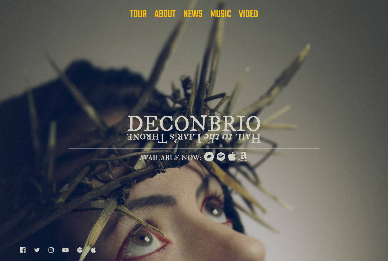
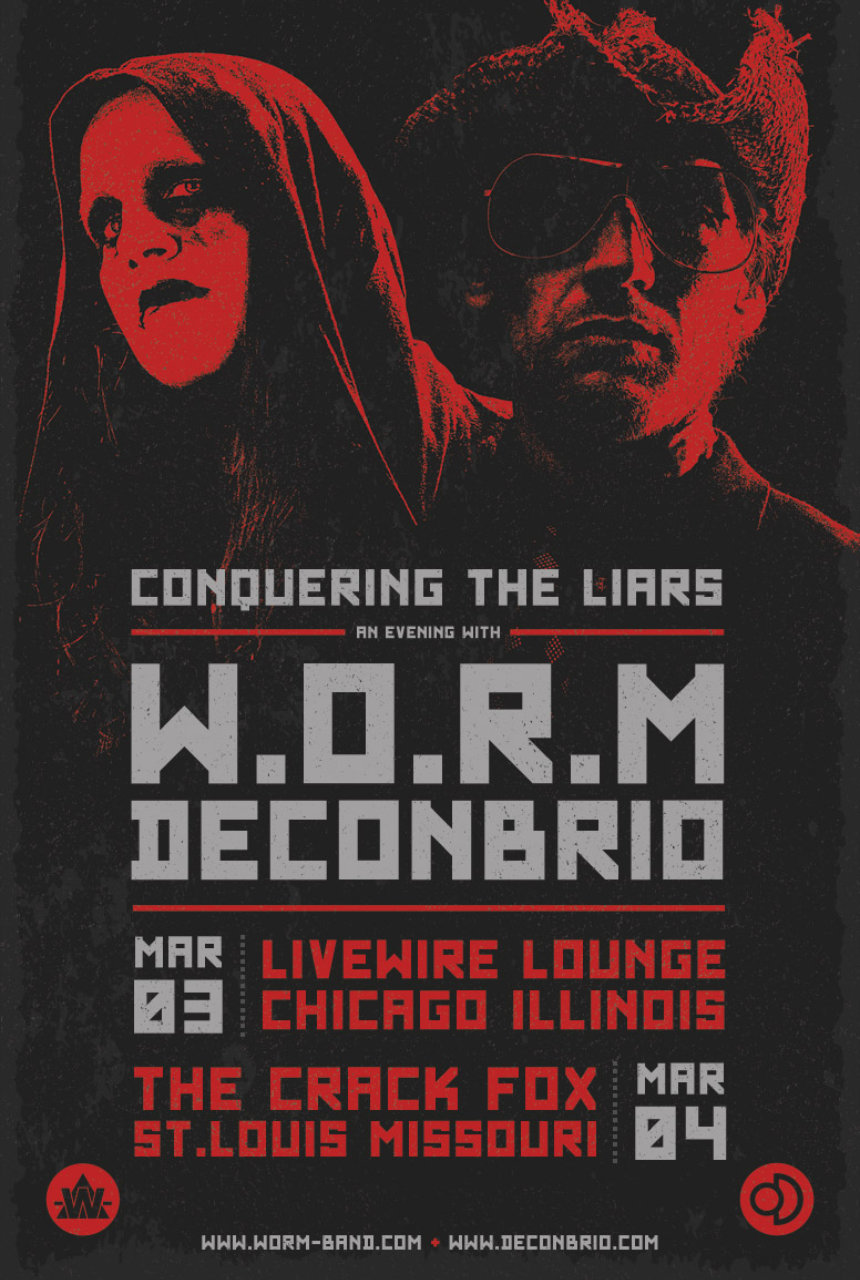
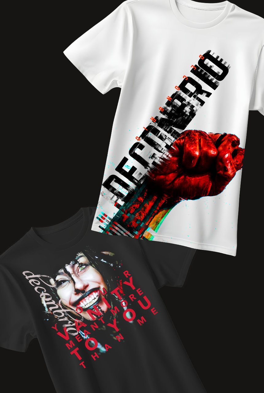
Scope: Logo Design · Visual Identity · Album Artwork · Promotional Material · Merchandise Design · Website Design
About The Client
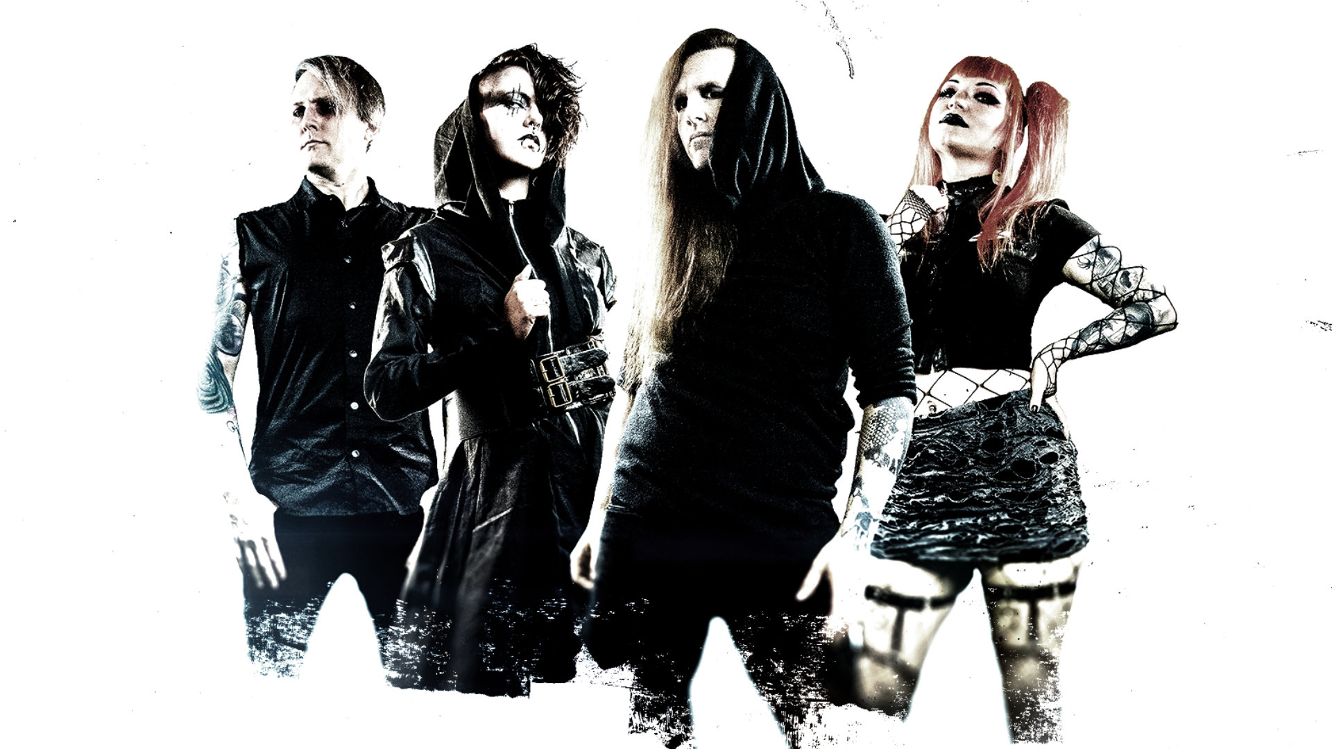
Deconbrio is a self-directed music project that I helmed for many years. And as the person responsible for both the sound and the look of it, I was my own most demanding client. The challenge wasn’t finding a visual direction that pleased someone else; it was finding one that was honest enough to actually represent what the music felt like. The goal was a cohesive visual identity that could hold together across every format the project lived in.
What I Did
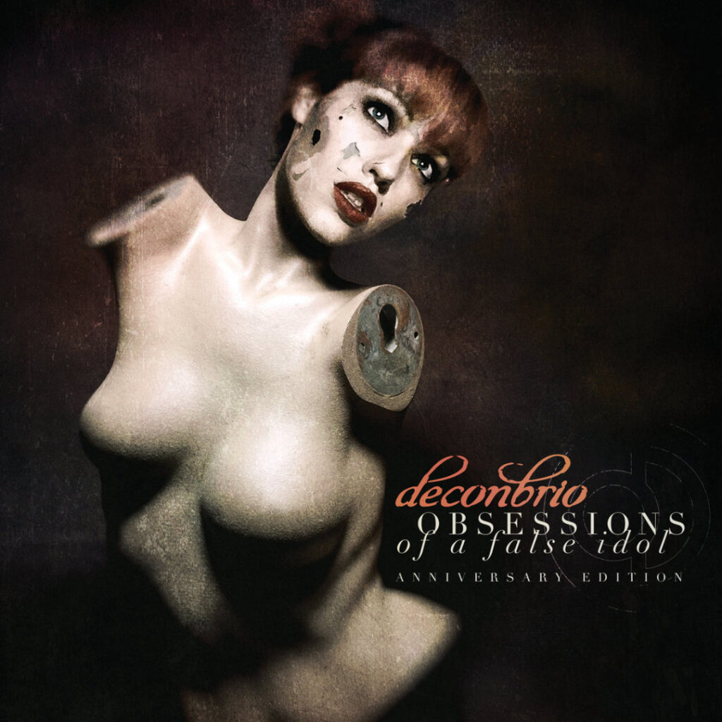
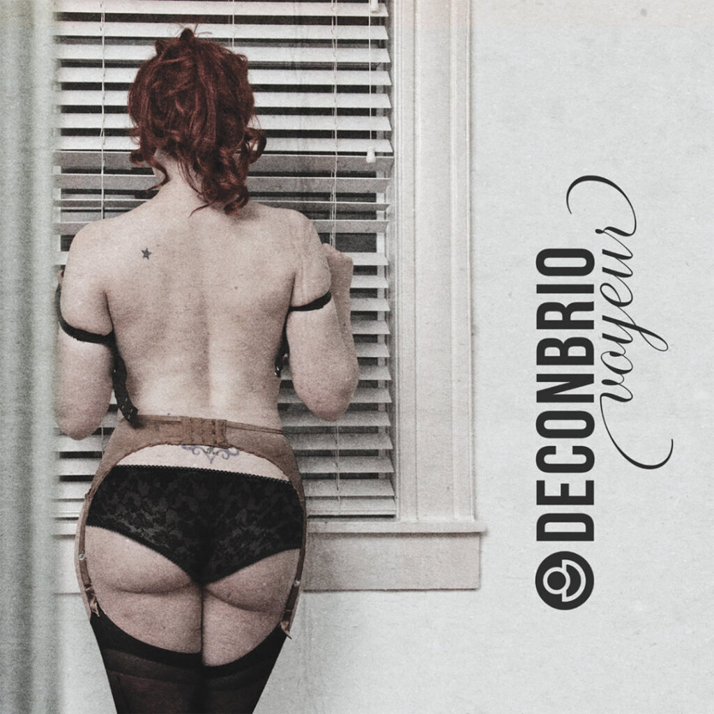
With no creative brief and no one to answer to but the work itself, I built Deconbrio’s visual world from the ground up. Every album cover, every piece of merch, every web layout, and every promotional asset was conceived and executed by me. The visual language had to do what the music was already doing: create a specific feeling, a specific atmosphere, something you’d recognize before you even heard a note. That meant making deliberate decisions about typography, color, imagery, and composition, and then living with those decisions long enough to know whether they were right.
The Outcome
Deconbrio never had a disconnect between what it sounded like and what it looked like. Over the course of the project, the visual identity evolved alongside the music: never chasing trends, and always answering to the same internal standard. It’s the body of work where I developed most of the instincts I bring to every client project today.