Project Summary
Client: Appalachian Equality Chorus
Industry: Nonprofit / Performing Arts
Location: Knoxville, TN
Scope: Brand Renaming · Art Direction · Visual Identity · Color System · Brand Guidelines
About The Client
Say hi to Appalachian Equality Chorus. Founded in 2012 as Knoxville Gay Men’s Chorus, the chorus spent a decade building a reputation as a performing arts organization and a voice for LGBTQIA+ advocacy across East Tennessee. As their membership grew to include singers across the full spectrum of gender and sexual orientation, as well as singers across other parts of the southeast region, the original name and identity no longer reflected who the organization had become.
What I Did
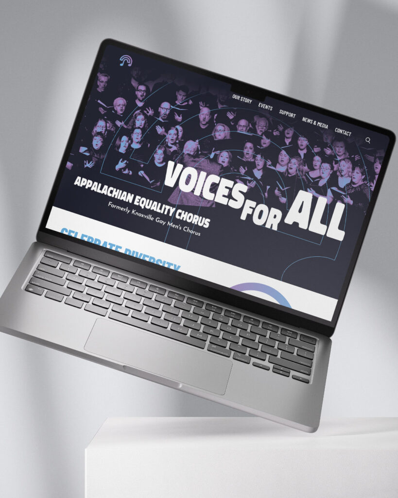
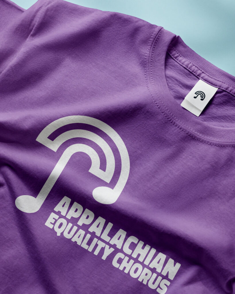
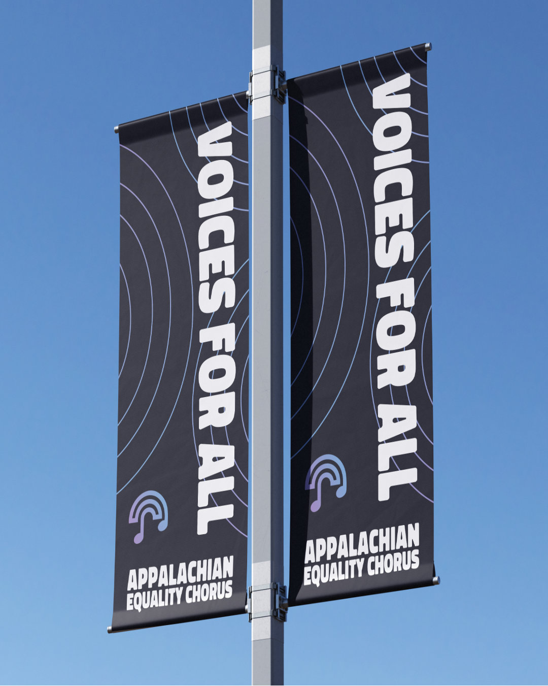
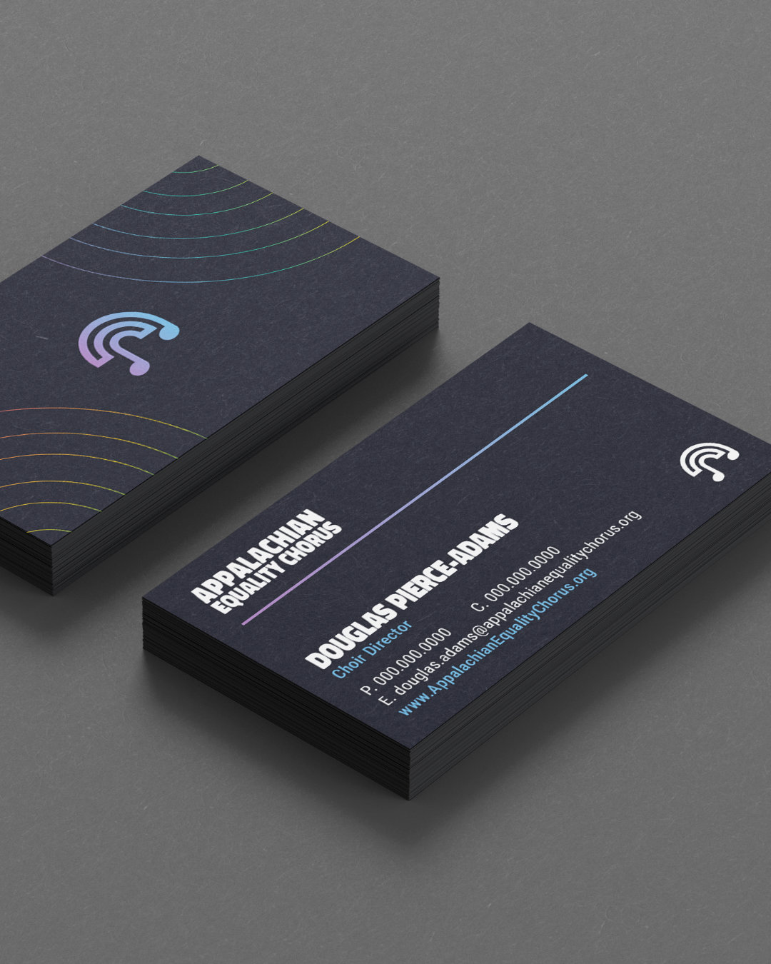
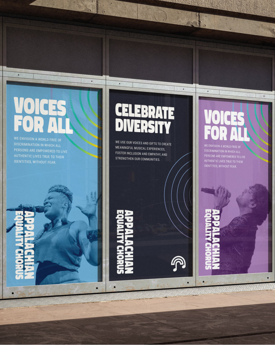
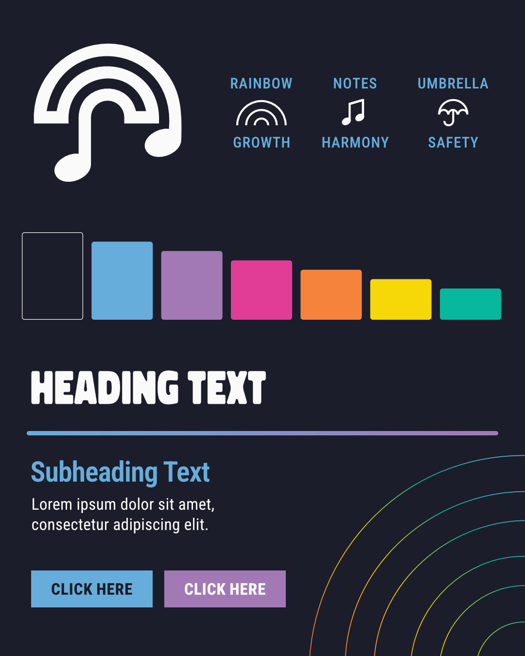
First, a new name was needed. After some intense brainstorming sessions with the lead brand strategist, the chorus’s stakeholders, and myself serving as Art Director in support of the strategist, we landed on Appalachian Equality Chorus. The name just felt right for the chorus, it rolls off the tongue nicely, and is not easily forgotten. From there, I began working on the new brand design. I sketched out a few ideas, which led to the final design of the “musical rainbow” mark. This icon represents growth (the rainbow), harmony (the musical notes) and safety (the umbrella).
Bold fonts, a vibrant color palette, and other visual elements were chosen to fit the vibe of the chorus’s bright, positive energy. The organization, which serves as a safe place for people to let their true identities shine, now has an identity that shines just as bright—like a beacon of love, positivity, and acceptance.
The Outcome
The Appalachian Equality Chorus name and identity are still in active use today. The organization has continued to grow under that brand, now numbering nearly 100 members across two regional chapters and drawing local and national press coverage. They have a name that better reflects who they are, and a gorgeous visual system that works in all mediums, and is one that Appalachian Equality Chorus wears loudly and proudly.