This one felt different from the start
Zeb and I met years ago at the same agency. When he eventually moved to Kansas City to launch his own video production company — serving the construction and trades industry — he reached out asking about logo design. What followed became my first real full-process freelance engagement. Strategy workshop, mood boards, mascot design, brand guidelines. Everything. The project where two decades of learning finally had the right container to pour into.
He approved everything with no notes.
Getting to know Flyover
In our strategy workshop, Zeb talked about being the kind of kid who loved LEGO bricks — always building, always figuring out how things fit together. That’s why he fell in love with the trades. That’s why this work means something to him personally, not just professionally.
That kind of clarity changes everything. When a client knows exactly who they are and why they do what they do, the design work stops being guesswork and starts being translation.
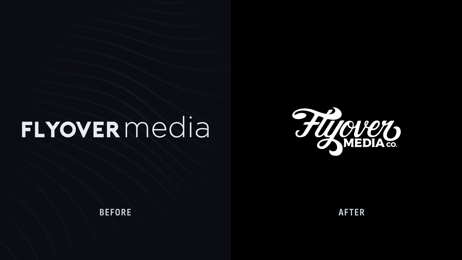
The visual direction that emerged from his inspiration was clear: Rustic Americana. Worn but not weathered. Gritty enough to feel real, refined enough to mean business.
What I built
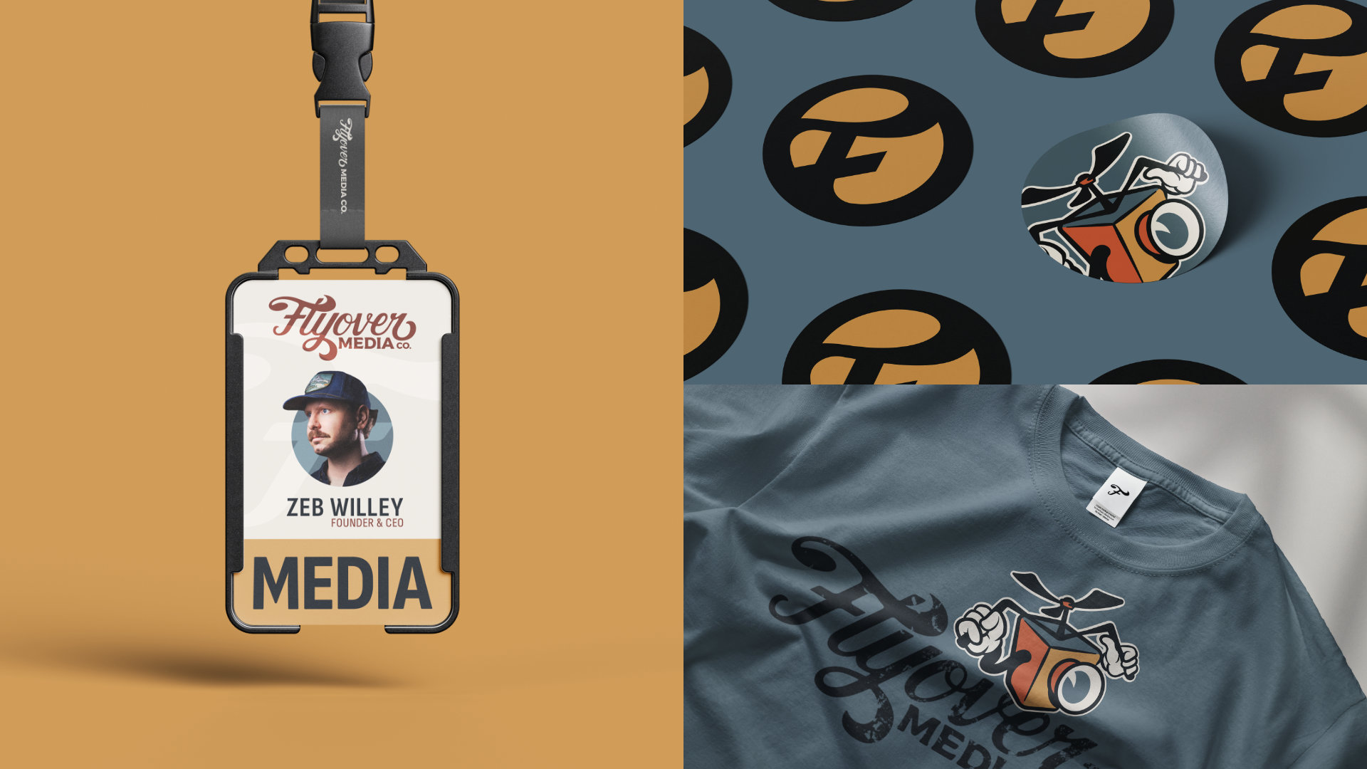
The wordmark was customized to feel hand-crafted and timeless. Every sharp corner softened into something worn and refined. There’s a quiet detail hidden in the F: its top arm exaggerated into the shape of a propeller in motion. A small thing that rewards a closer look, which is exactly the kind of detail that separates a mark from clip art.
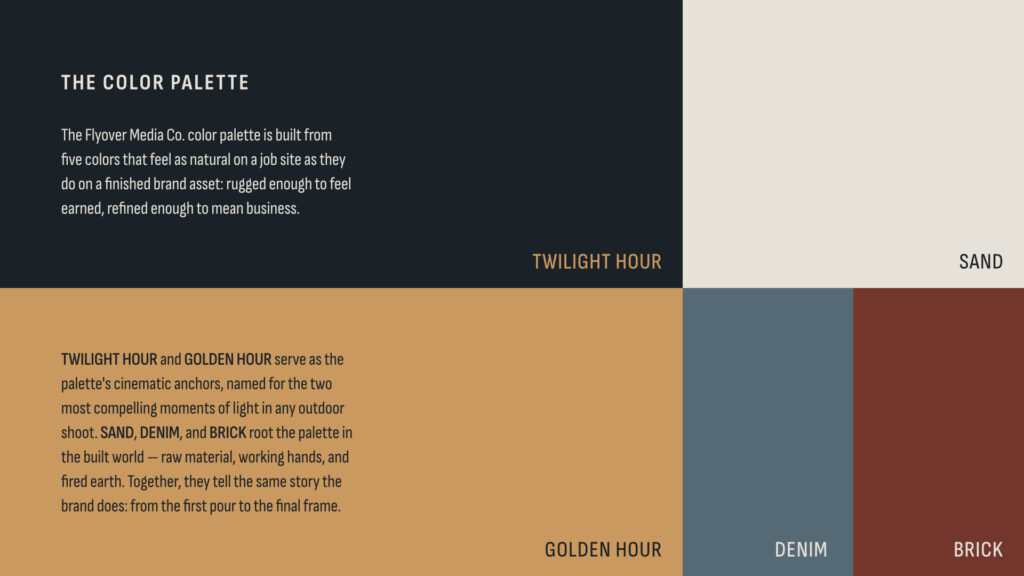
The color palette pulls from both the cinematic and the physical. The light on a job site at dusk. Raw materials. Fired earth. Colors that feel earned.
And then there’s Floyd. Zeb mentioned wanting a mascot early on. I sketched a character in the Fleischer-era animation style: pie-cut eyes, rubber-hose limbs, the scrappy curiosity of someone who always finds the angle nobody else thought to look for. Zeb warmed up to him once he understood Floyd is the personality behind the brand: modular, animatable, and entirely his own.
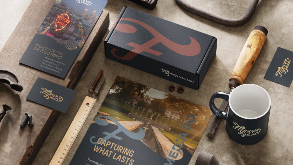
The new face of Flyover Media
The brand is out in the world now. Zeb’s website, his social media, his whole presence — it all looks exactly like him. Sleek without being corporate. Earned without being rough. The kind of identity that makes you feel like you already know who this person is before you’ve watched a single frame of his work.
That’s what the strategy process makes possible. Not just a logo that looks good — but one that actually means something. To the client, and to everyone who encounters it.