Project Overview
Bridge Connector is a healthcare SaaS company working to connect disparate systems and data across healthcare organizations. I was first commissioned to design their initial logo as a freelancer, but I eventually joined the team full-time as the creative lead on the marketing team. As the company grew, it became apparent that the logo was not growing with it.

The Problem
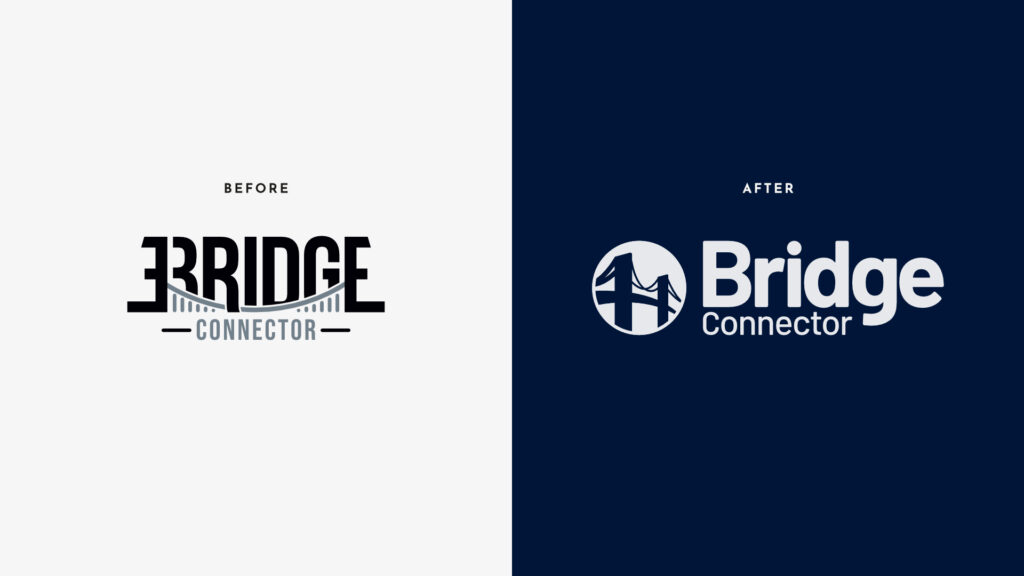
The original identity was designed when Bridge Connector was still finding its footing. By the time the company was pitching hospital systems, exhibiting at major healthcare conferences, and operating as a Salesforce AppExchange partner, that brand identity was working against them. It didn’t communicate trust, stability, or scale. Hell, it barely communicated the company’s name.
So, the goal for me was to give the logo a complete overhaul, as well as to build a complete visual system for the brand identity—one that could hold together across every context the company operated in.
The Process
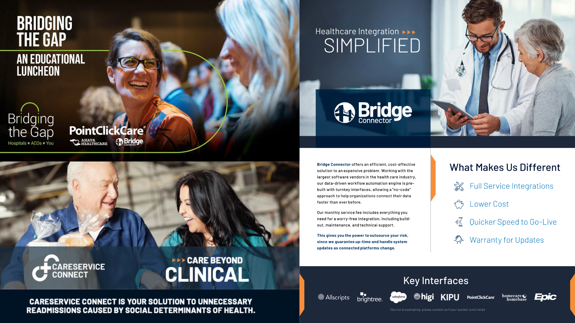
The new identity centered on a circular icon mark with a stylized bridge: immediately readable, scalable from favicon to trade show backdrop. A bold word mark and deep navy palette completed a system built to communicate competence and clarity at a glance.
From there I developed the company’s first comprehensive brand guidelines: logo usage and clear space rules, color architecture with print and digital specifications, typography standards, and tone and voice documentation.
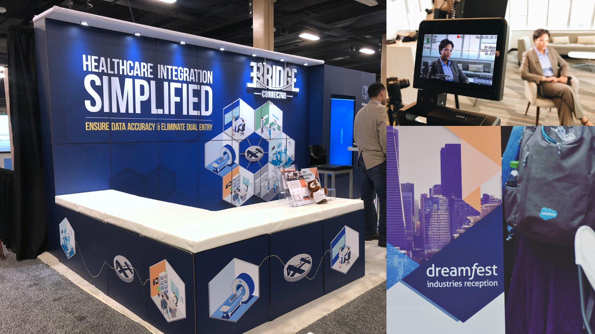
One persistent challenge was visualizing the product itself. Healthcare integration is abstract. There’s no obvious way to show data moving between systems. So, I developed a hexagonal isometric illustration system that gave it a visual language: connected environments representing different points in the healthcare workflow, linked by a consistent dotted path across all collateral. When stock isometric assets ran out of usefulness, I built custom illustrations from scratch. This became the foundation for Lottie animations that ended up on the website.
The Work
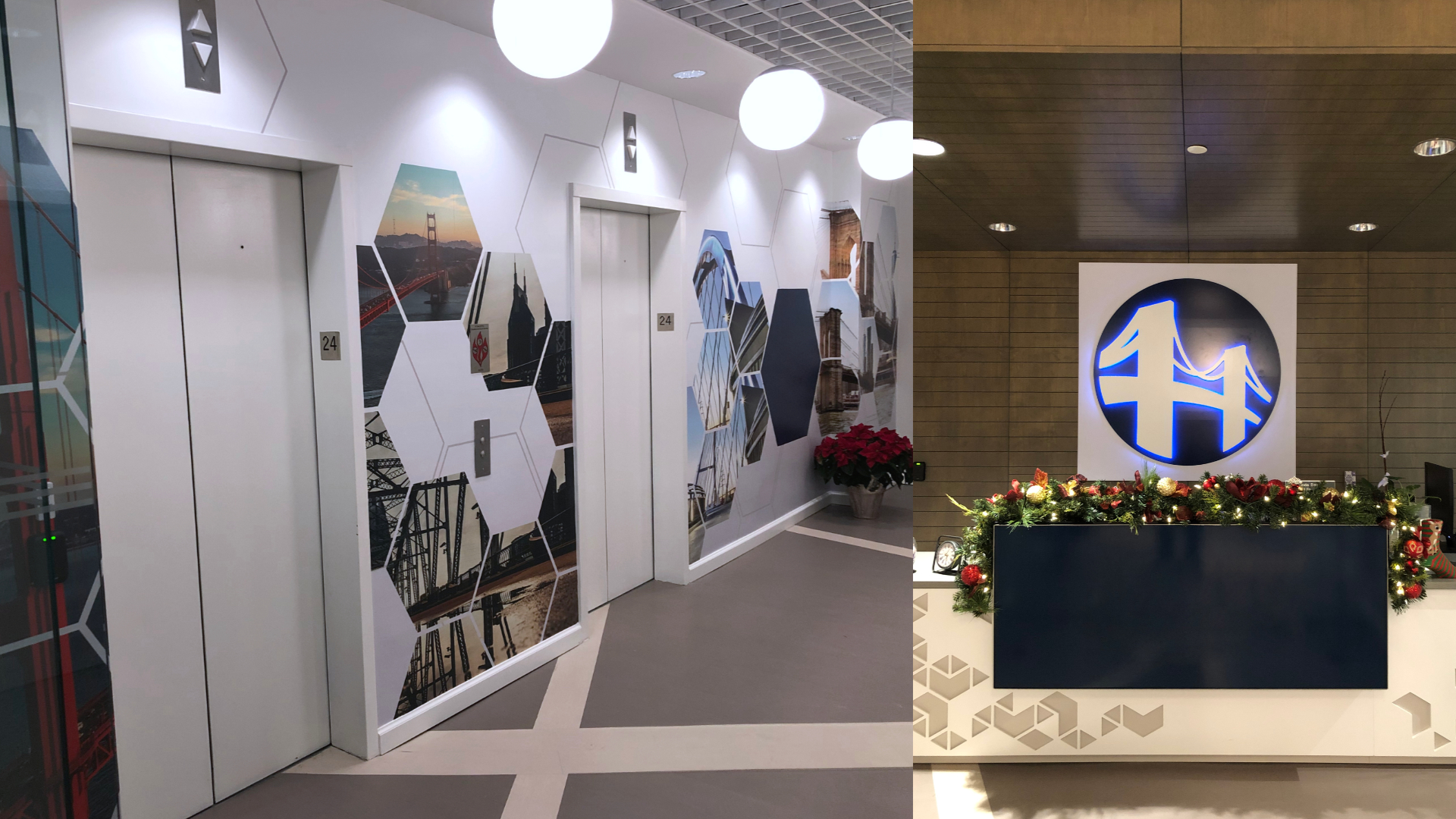
The system scaled into everything the company needed: tradeshow booth environments for HLTH and Dreamforce, elevator lobby wall graphics spanning the entire 24th floor of Bridge Connector’s Nashville office, sales collateral, presentation decks, social graphics, and video assets.
The Outcome
The rebrand shifted how Bridge Connector was perceived at the enterprise level. Investors and prospective clients engaged with the company differently once the visual system reflected where the company had actually arrived. The brand held up across multiple major healthcare conferences without revision, and the isometric illustration system became one of the most consistently used assets across the marketing team’s output. Working alongside leadership with high standards and significant design exposure, the work never came back for fundamental changes which, at that scale and pace, is its own kind of result.