About This Project
Appalachian Equality Chorus had evolved beyond the identity that launched it. Originally founded under a narrowly defined name, the organization’s membership and regional reach had expanded—creating a growing gap between perception and reality. The challenge was to realign the brand with its inclusive mission and broader Appalachian presence without erasing its activist roots.
The Problem
The existing name created confusion around who the chorus represented. As membership diversified and rehearsals expanded beyond Knoxville, the identity signaled limitation rather than growth. The organization needed a name and visual system that clarified its inclusivity immediately—without requiring explanation—while supporting long-term regional scalability.
My Role
I led the renaming and identity development process from concept through execution. Early naming exploration introduced a geographic framework that ultimately shaped the final name, anchoring the organization in Appalachia while expanding its inclusivity.
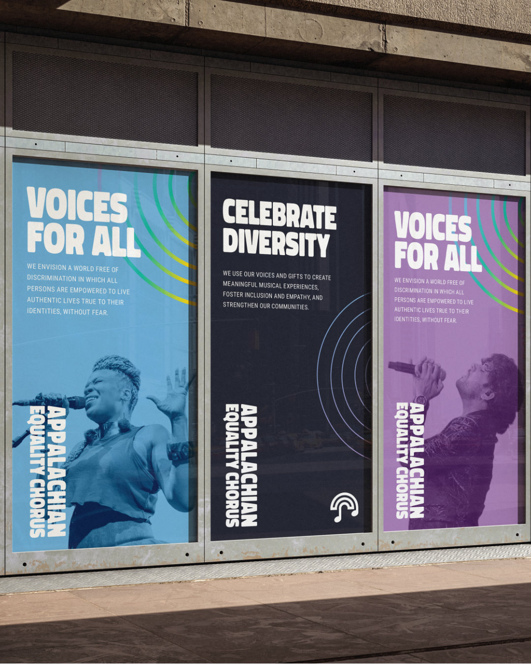
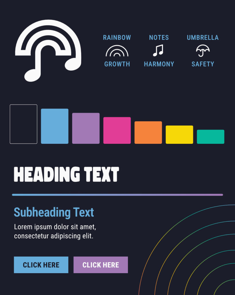
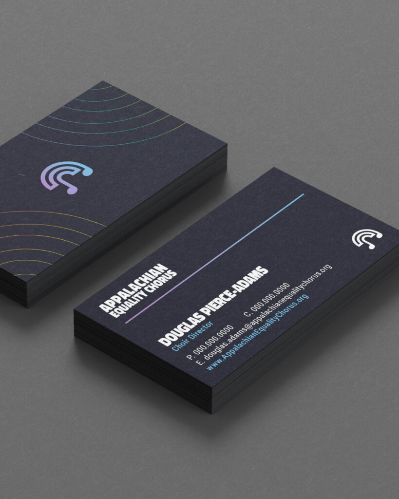
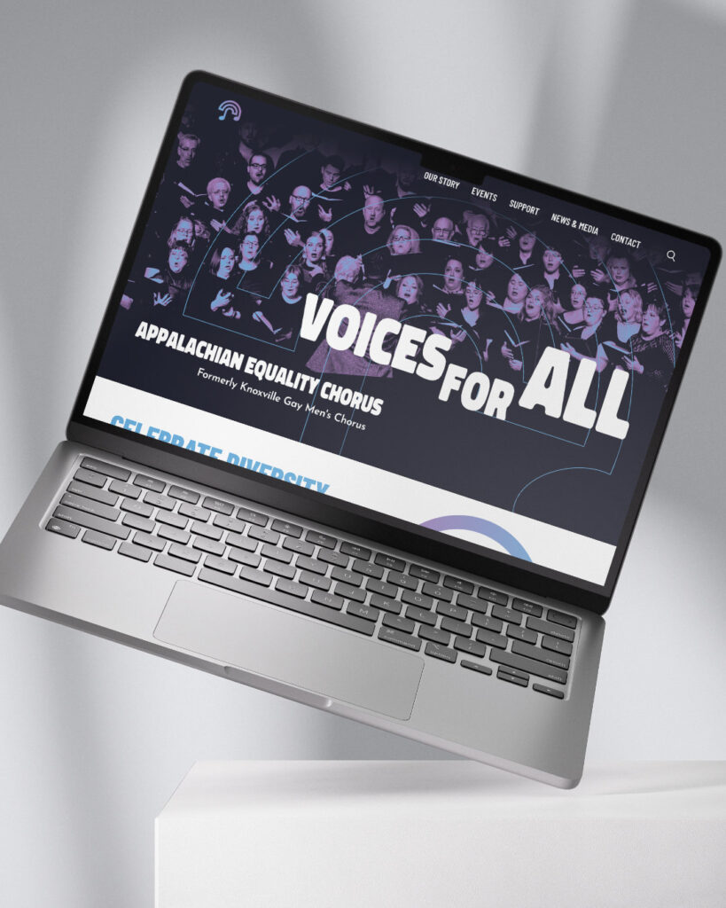
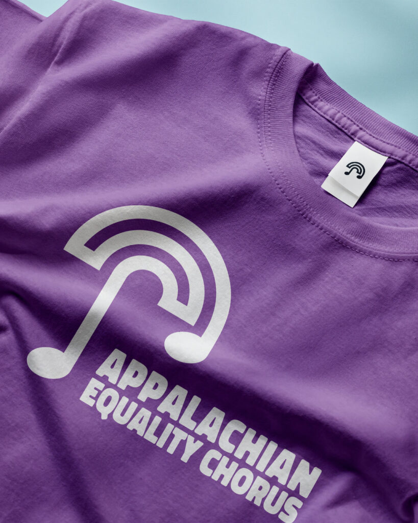
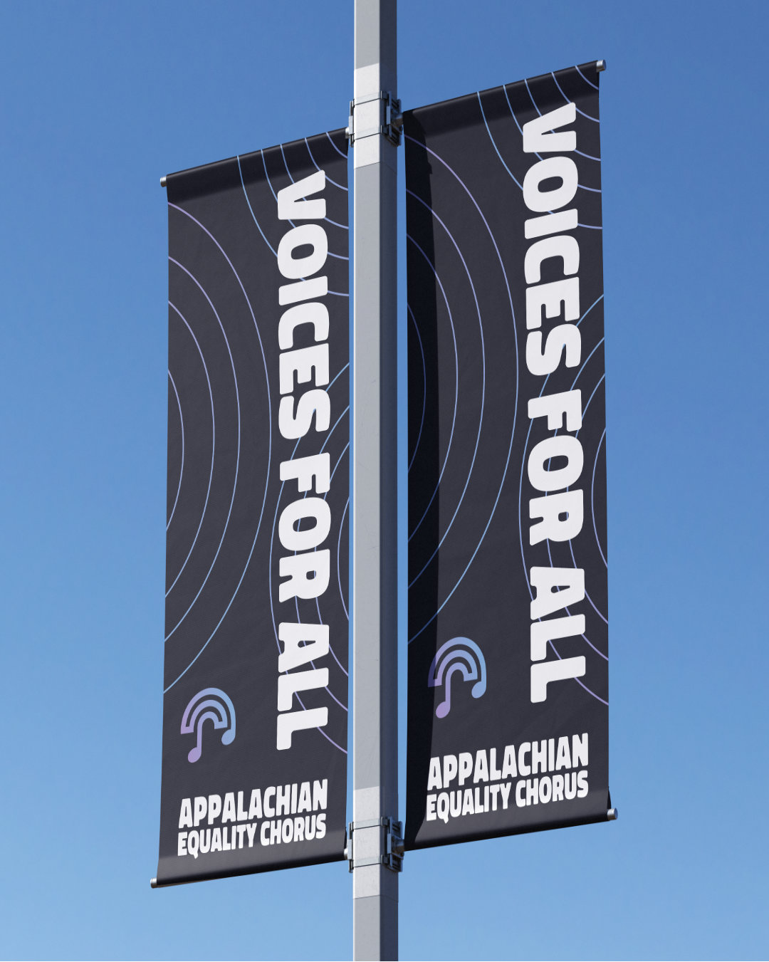
From there, I developed a visual identity system built around a continuous-line mark that subtly references unity, growth, and harmony. Typography and color were selected to balance approachability with institutional maturity, creating a system that could scale confidently across stage environments, digital platforms, and community outreach.
The Result
The rebrand repositioned the chorus from a narrowly perceived ensemble to a regionally recognized, inclusive arts organization. Since its implementation in 2022, the identity remains the foundation of its communications, providing clarity, cohesion, and a durable platform for continued growth.