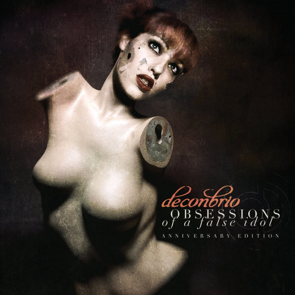
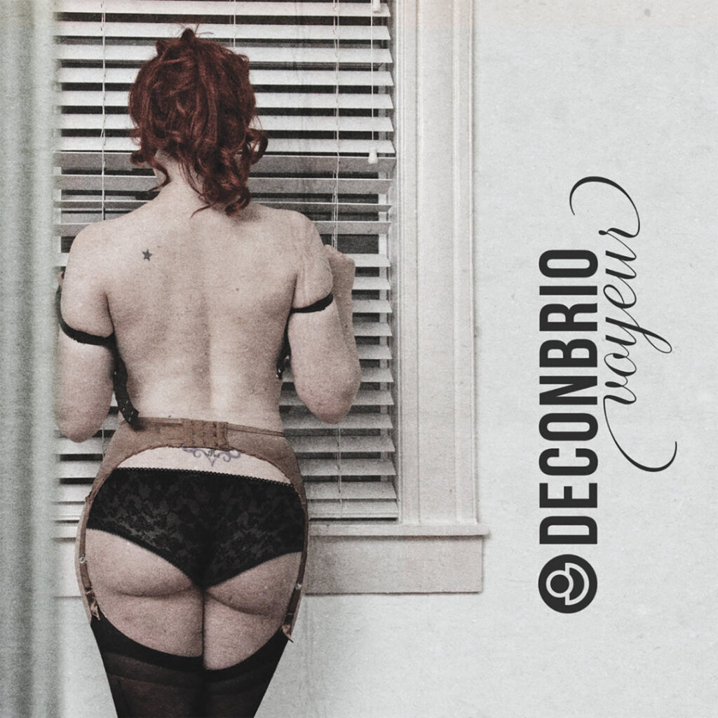
About This Project
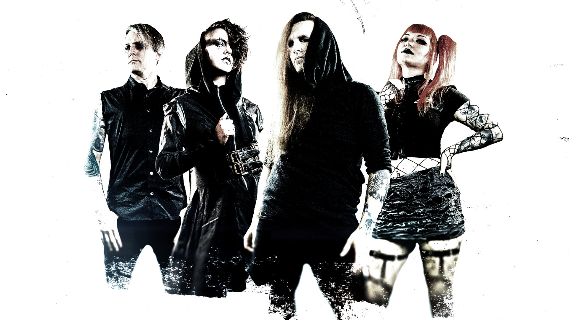
Deconbrio is an industrial rock band I worked with long-term, handling all visual direction and design. From the band’s logo to album artwork, tour posters, websites, and merchandise, every visual decision was made to reflect the tone and intensity of the music.
The Problem
Industrial music relies heavily on atmosphere and identity. Without a consistent visual approach, releases can feel disconnected. Deconbrio needed visuals that clearly communicated who they were as a band across albums, tours, and promotions—without relying on trends or decoration.
What I Did
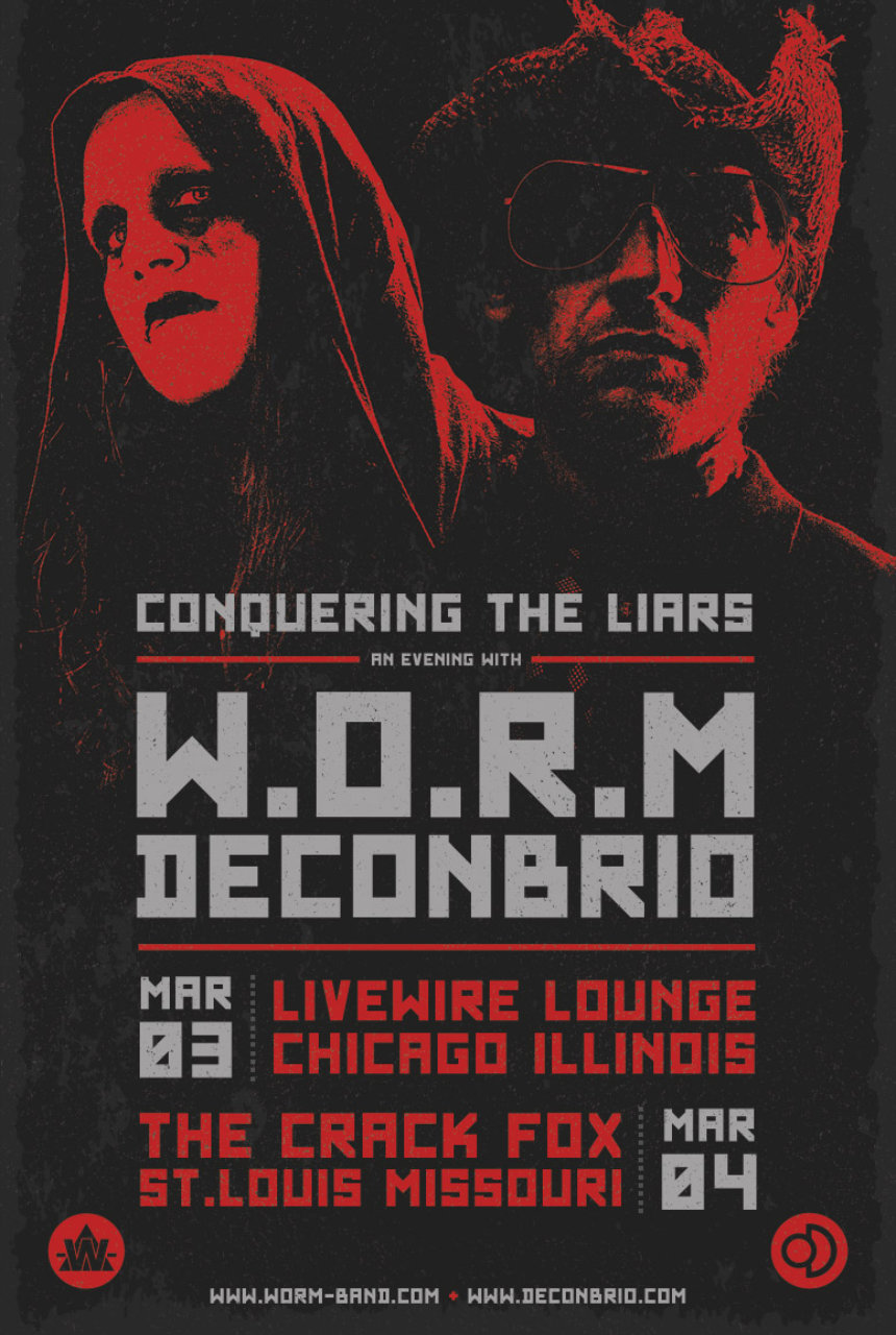
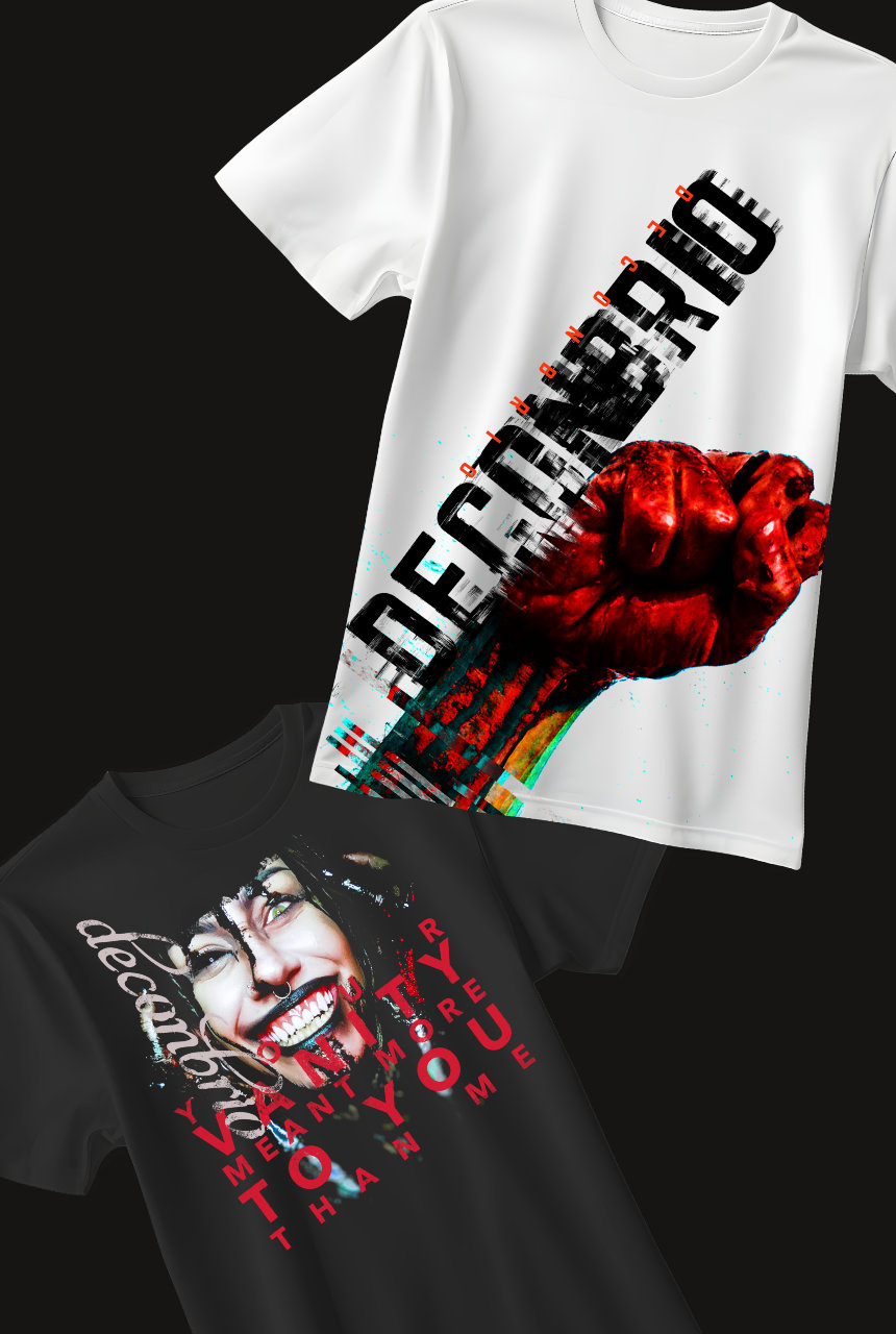
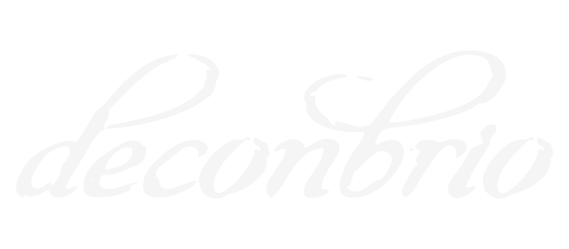
I designed the band’s logo and created artwork for every release, developing a visual language that evolved alongside the music. Each album informed its promotional materials, including flyers, tour posters, digital assets, and merchandise.
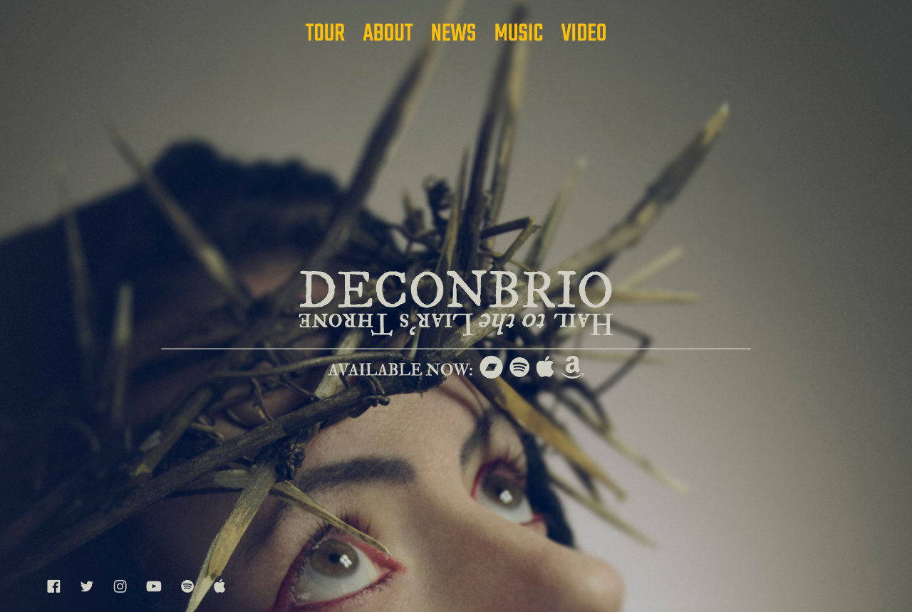
I also designed and maintained the band’s website, updating it with each release so the online presence reflected the current album’s aesthetic. The focus was consistency—making sure every touchpoint felt intentional and connected.
The Result
Over time, Deconbrio developed a recognizable visual identity that reinforced the music and gave each release a clear place within the band’s larger body of work. Fans could immediately connect the visuals to the sound, and every new release felt on-brand.